Something I am passionate about is user experience. Of course everyone knows bugs are annoying, but simplicity and design are often overlooked and in many ways more important than the HOW of the actual program. The User Interface is very forward facing, it is the salesman, the customer service representative at your favorite store. It does not matter to you (the customer) how they ring up what you purchase, but what matters to you is the experience at shopping at your favorite store. This is why user experience and design are important – It is the experience of the customer.
Tonight, I went to a Refresh Dallas meeting. This is the 2nd one I went to, I enjoyed the first and enjoyed this one even more. This time, Travis Isaacs and Stephen P. Anderson shared their information design secrets who work for a company called viewzi. I had heard of the company before, basically they are a search engine company and take a unique visual approach to search.
During the presentation, they had a challenge, they gave a Flight Information sheet and the idea is to redesign it for the purpose of Better Information Design.
Really quickly, let me highlight some principles they taught
1) Define the senerio
2) Identify the nodes of Information
3) Organize to reduce complexity
4) Remove unnecessary information
5) Emphasize the most important information (minimize the less important stuff)
6) Hide non-critical information
7) Display information visually
8) Use Task-Based Language
9) Tighten it all up!
10) Ensure it’s flexible
11) Create a consistent visual language
Ok, now on to the challenge and what inspired me to stay up and write this blog post tonight.
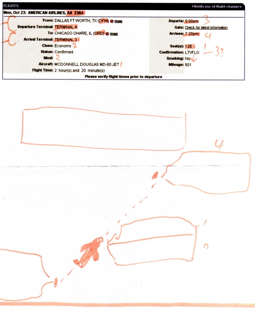
We took either very short or non-existent (for time sake) separate breaks for each of the items they listed (see above). By the end, I had the following.
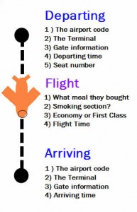
The concept is a map format. As the passenger perspective, one needs different information at different times – like when following a map. In this case, one would not need to know the departing gate and arriving gate at the same time. So each block represented data along the journey. Ignore the top empty block, it would of been erased if I had time. Now you have 3 blocks.
Starting from the bottom is Dallas, a passenger going to the airport and boarding will need to know
(this is the box closet to bottom)
1) The airport
2) The Terminal
3) Gate information
4) Departing Time
5) Seat number
In flight, a passenger may want to be reminded.
(this is the box 2nd from bottom)
1) What meal they bought
2) Smoking section? (of course this information is irrelevant in US)
3) Economy or First Class?
4) Flight Time
Arriving to the Chicago airport, need to know information is
(this is the box 3rd from bottom)
1) The airport
2) The Terminal
3) Gate information
4) Arriving Time
Incidentally, the “erased” block could be used for information that would be common to all 3 blocks such as name of person flying, Flight number, etc.
I was pretty proud of this and decided to show it to them. They both really liked it. I think it was Travis who said he does not think he has seen that approach before and the other, I think it was Stephen, who said now a 5 year old can read that!
Here is a rough draft number 2.
I did this in about 10 minutes, so it is far from perfect. Hopefully it will give you a clearer picture of the design idea.
Let me take a moment…..Thank you Steven and Travis for the presentation! I enjoyed it! Also thank you for the kind words, it really has validated my desire to work more in Media.
Jared
http://jaredfarnum.com
—————————————
UPDATE 9PM – July 25th
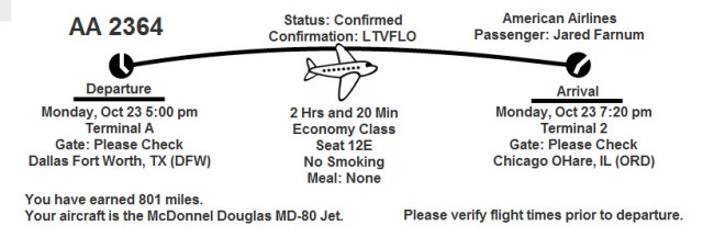
Earlier today I worked on a better version of this.
I set the following rules for myself.
– Original is black and white, so I will assume only black and white printer
– Keep all information from original.
– Keep approximately the same aspect ratio – maybe it prints out like a receipt at a kiosk or something.
Note
– the grouping of items
– the visual workflow supported by the airplane diagram
– the analog timepiece hands
Compare the original with the new design side by side. Which do you like better?
Jared Farnum
http://jaredfarnum.com


Definitely an original take on it:)